By and For
Food People
ChowNow is the digital ordering platform built by and for food people to help independent restaurants thrive. During the pandemic, ChowNow saw a huge increase in demand for digital ordering from restaurants and diners. But as the world opened up again, the market was saturated with products with similar offerings. Our challenge was to highlight the thing that makes the company truly unique among the competition: ethics. While other services were charging high premiums and fees on every order, resulting in a net loss to restaurants, ChowNow stood out by charging a monthly subscription that doesn’t harm the restaurant’s bottom line.
So, who are food people? They’re passionate about local traditions, opinionated about the best burger in town, curious about ingredients and how a dish comes together. They’re cooks and eaters who inhabit small town diners and explore East LA hot spots; order pizza in Minneapolis and bring their kids to farmers markets to learn about good food. To them, and to ChowNow who was built by food people, good food matters because a good meal goes beyond the flavors on the plate.
Together with Gretel we created a new visual system that retains the spirit of the company, while introducing a more consistent and elevated visual language. Our research and strategy informed the extent of our work to ensure a cohesive brand expressed through, voice, design, motion and photography.
Roles and Contributions: Creative Director, Strategy and Positioning, Producer.
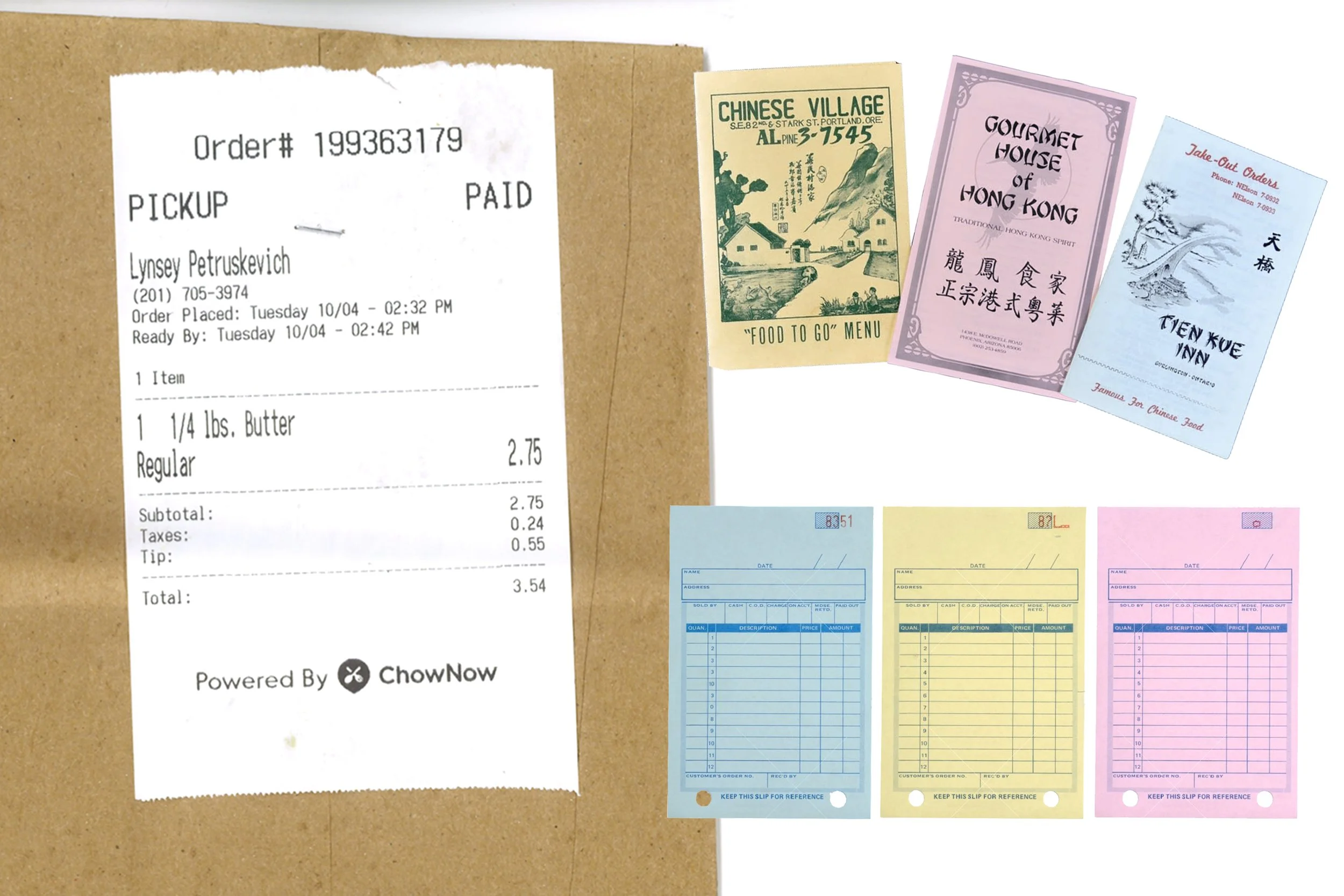
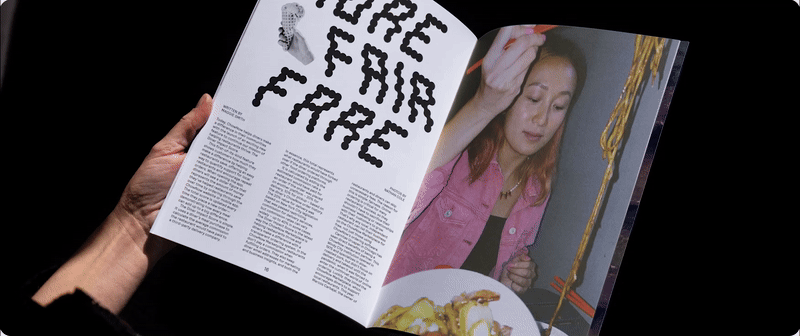
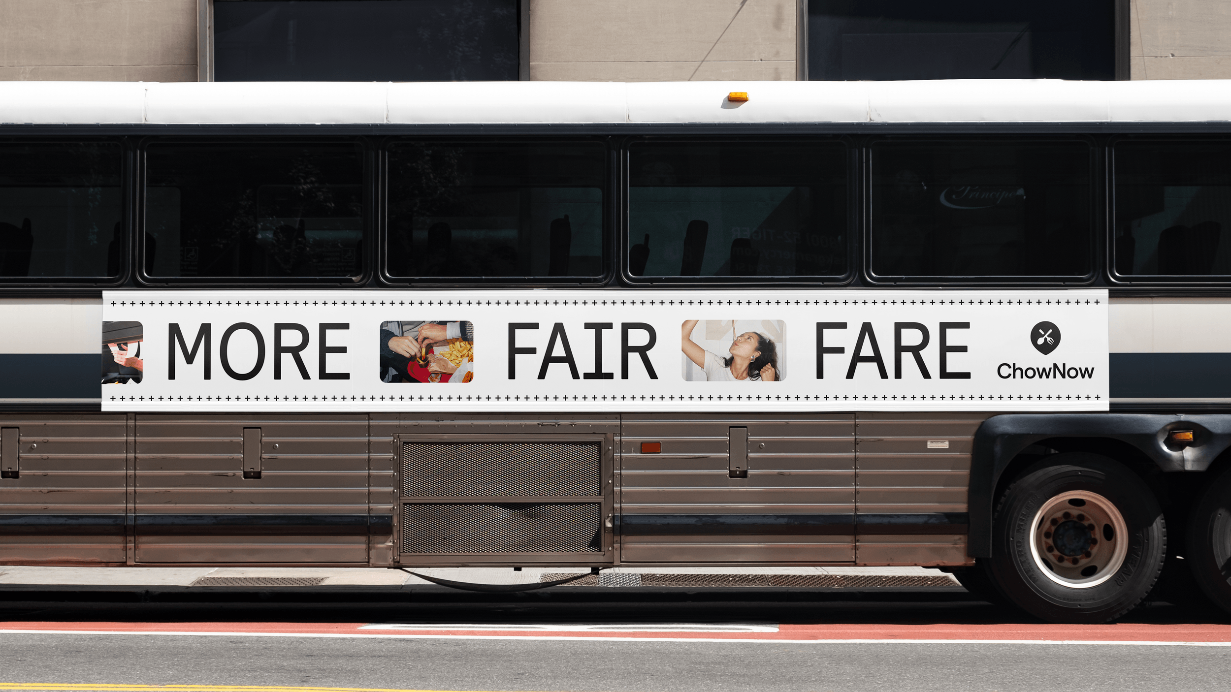
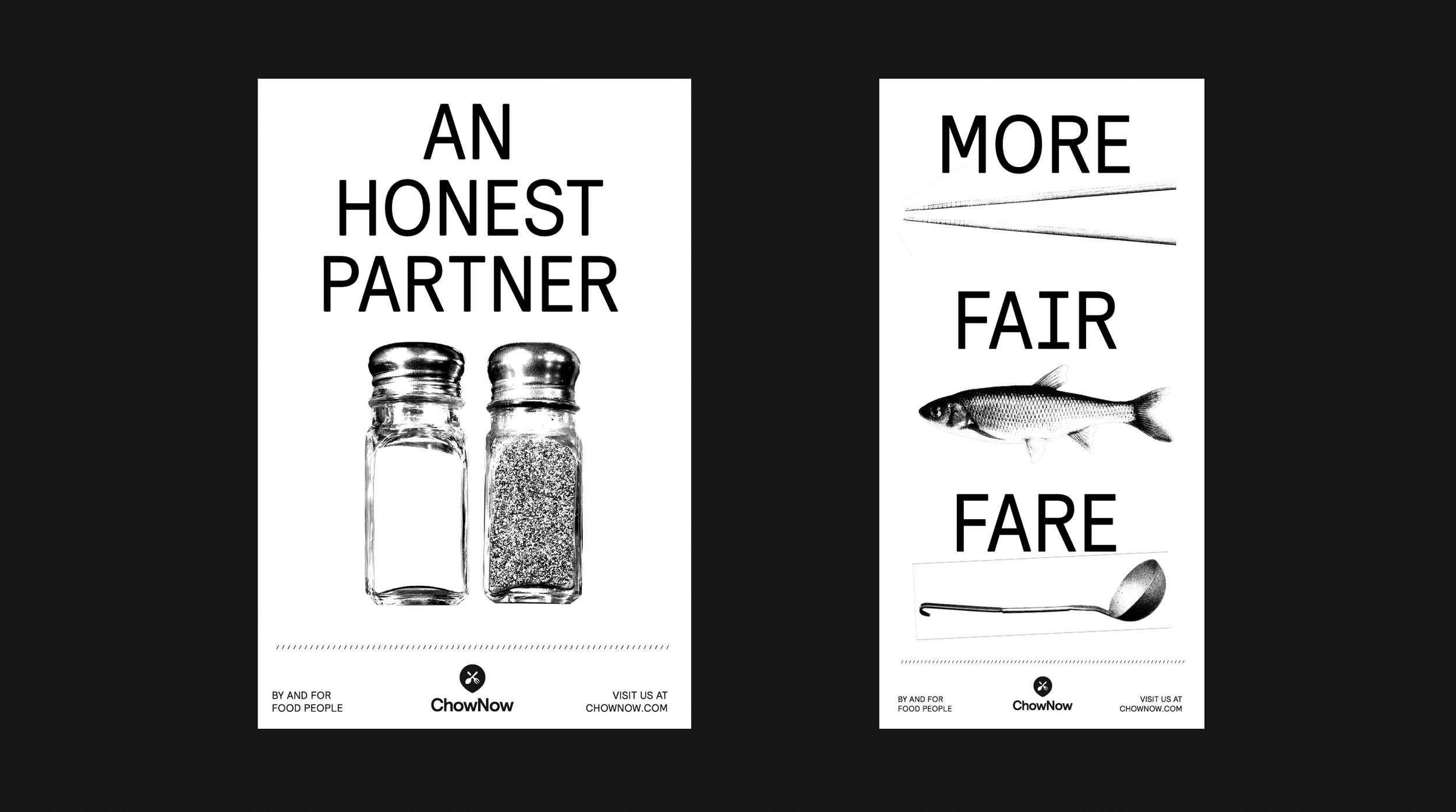
Our inspo: takeout menus and receipts
During our research phase we got to speak with many of ChowNow’s customers to understand the competitive landscape and what drew them to the service. One of the things that stood out to us is that most of these customers were mom-and-pop shops that needed help ‘going online’. That inspired us to look at the colors and shapes that surround their restaurants and kitchens. We were drawn to their meal tickets and receipts in particular, and how design is informed through black and white type and ASCII symbols.

Brand Elements
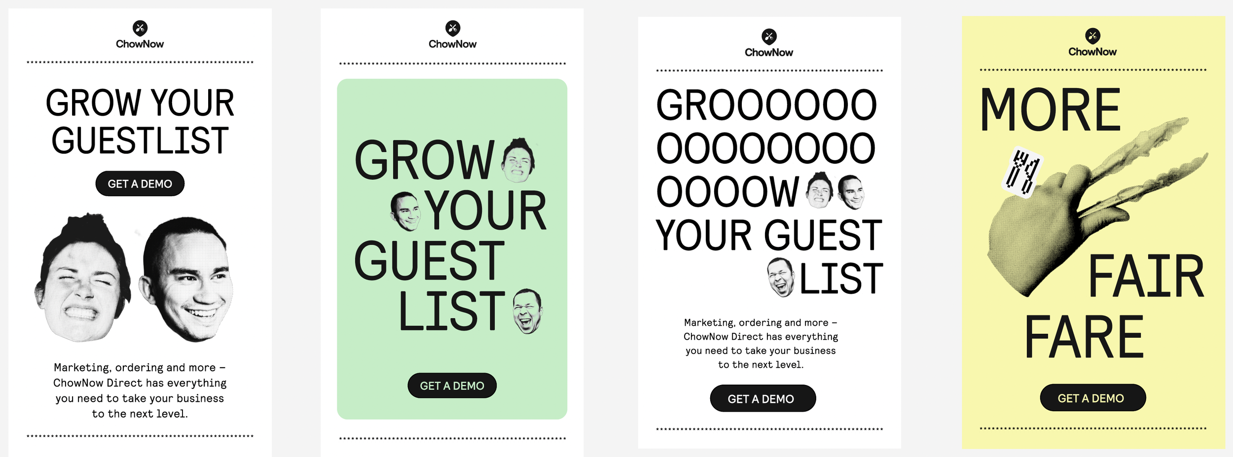
Just like restaurants, we wanted to make sure the overall brand system allows for variety and exploration, while maintaining consistency across brand elements.
We eventually landed on a design system that was able to balance the ChowNow brand while remaining expressive and lend itself to every restaurant partner who wanted to promote their own takeout service.
Logo
The Chow now logo needed some fine tuning too. Over the years the wordmark evolved separately from the icon, and we saw an opportunity to strengthen the relationship between the two.


Tone of Voice:
The True Partner
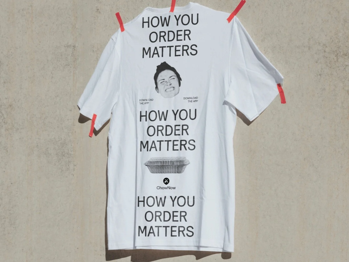
In a world that too often obscures the real message, ChowNow’s tone of voice aims to be a refreshing breath of fresh, clear air. Straightforward but friendly, plain-spoken but empathetic, ChowNow is able to deliver what matters in ways that help everyone understand and act – diners and restaurants alike.
Our objective is to deliver important, value-driven messaging to the audiences that need to hear it – in ways they’ll want to hear it. That means being more optimistic and engaging with diners; clear and assured with restaurants.


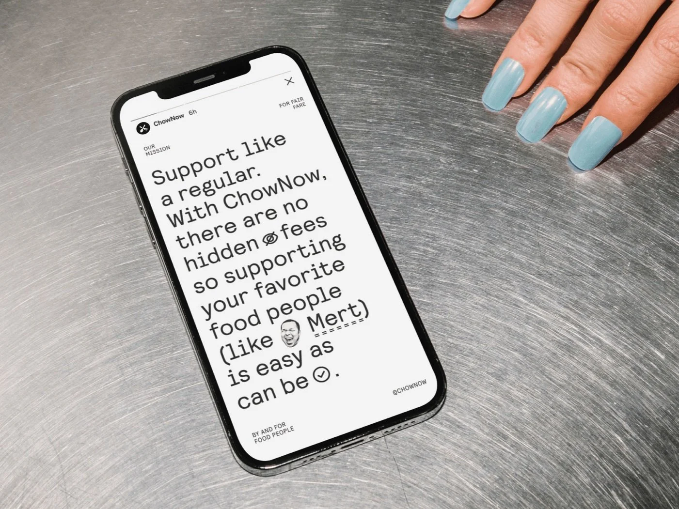
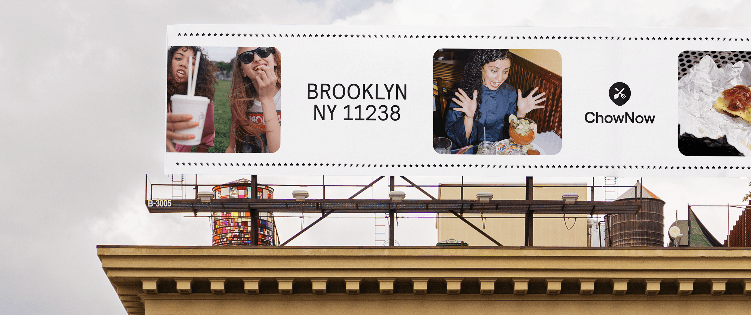
Marketing
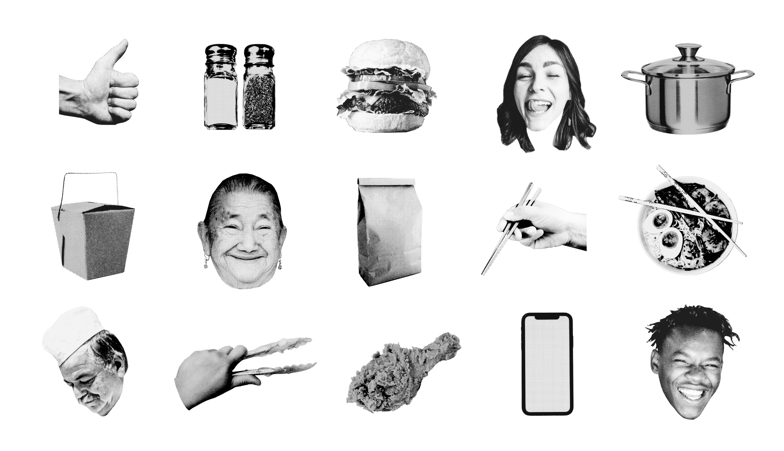
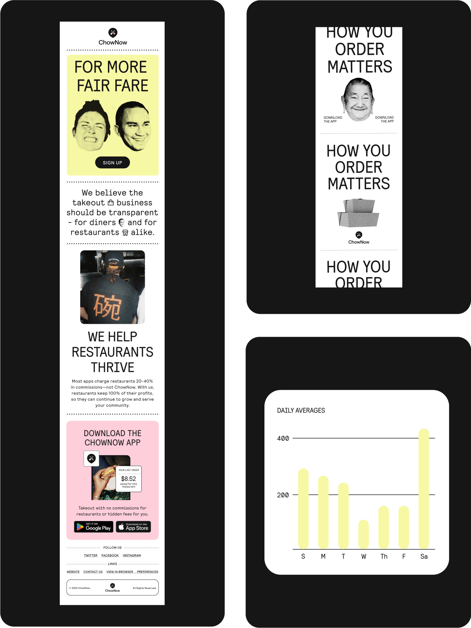
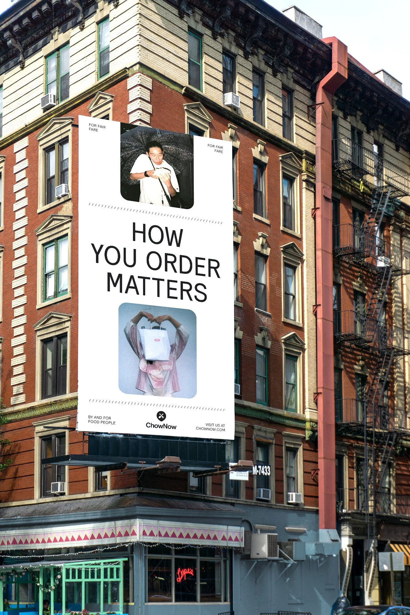
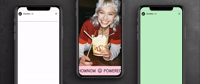
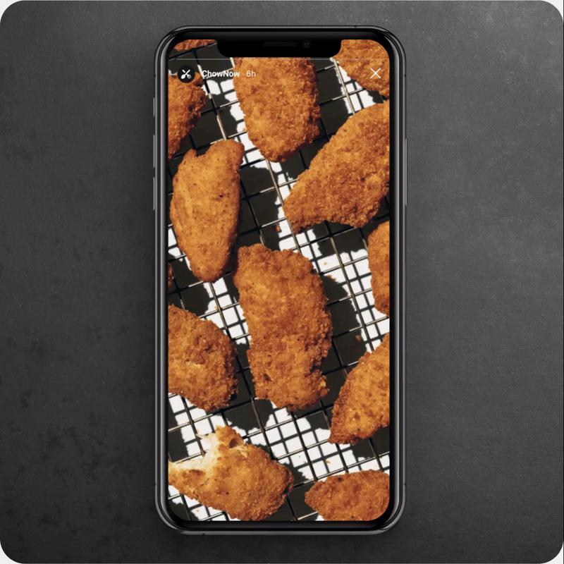
When looking at most meal ordering apps, their marketing focused on the ‘end product’, aka the food. While food appeal is important, we felt like those images are devoid of humanity. People wanted to see the faces and people who are prepping our meals, and ultimately to get to know better the person behind the kitchen.
So in ChowNow’s marketing we expanded the visual vocabulary to include faces, people, and icons that restaurants typically use when it comes to online ordering.


Motion
Another instance where our original inspiration from the resturant receipts influenced ChowNow’s brand. Motion is sharp and mechanic, emulating the feeling of type and imagery being printed out from a cash register.
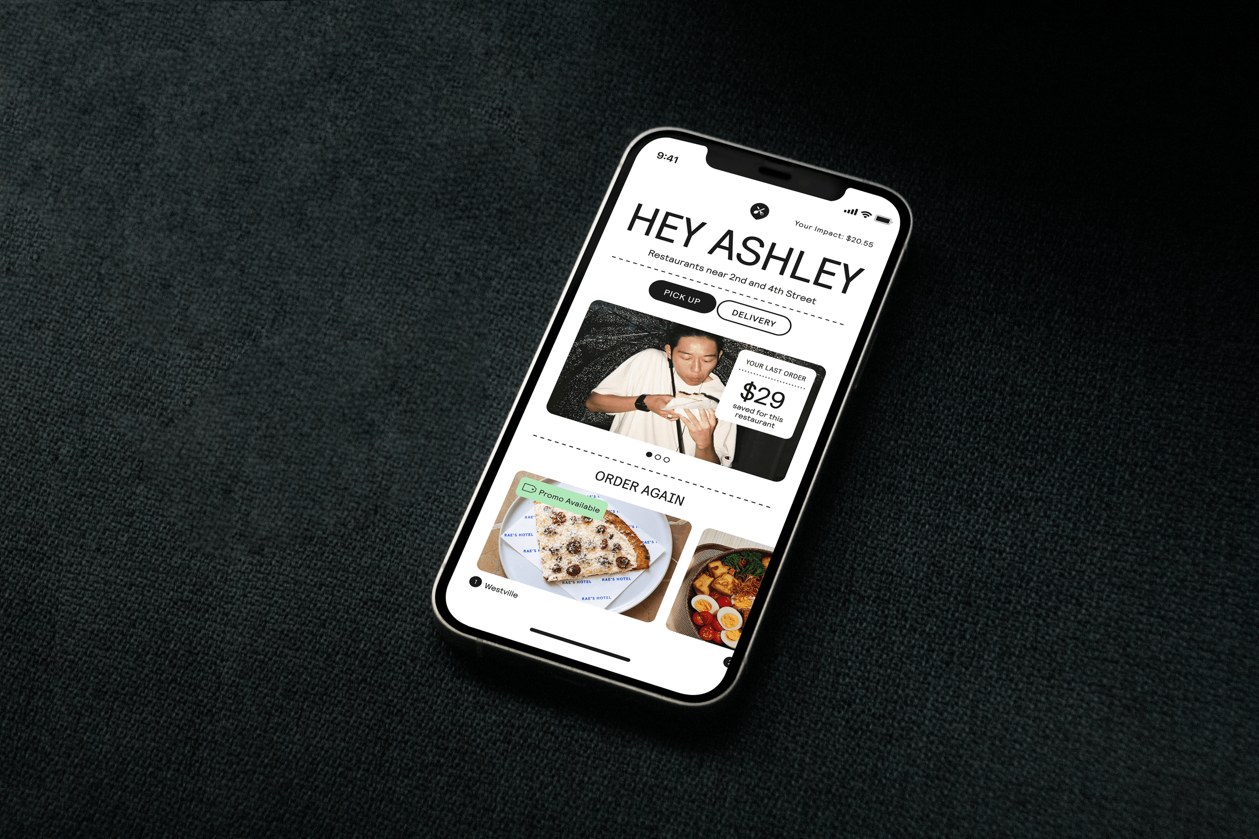
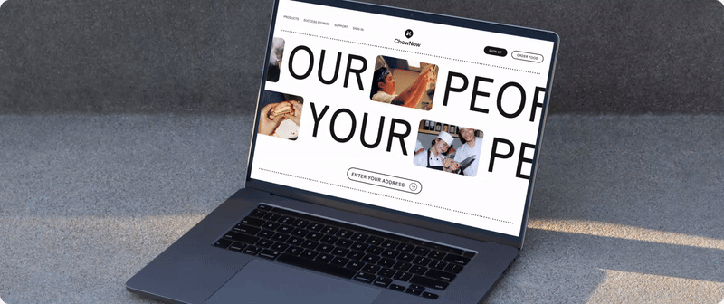
Product Design
Ultimately the product is at the heart of the brand - what we feel and associate with the brand is largely informed by our experience using the product. We worked closely with the product design team to ensure that the vision, colors, and guidelines for the brand can translate into the product as well.